


#003 - Circle Defeats the Oligarchy

Why did I make the first comics jpegs? I have no idea why I did that. Maybe it was the default file type?
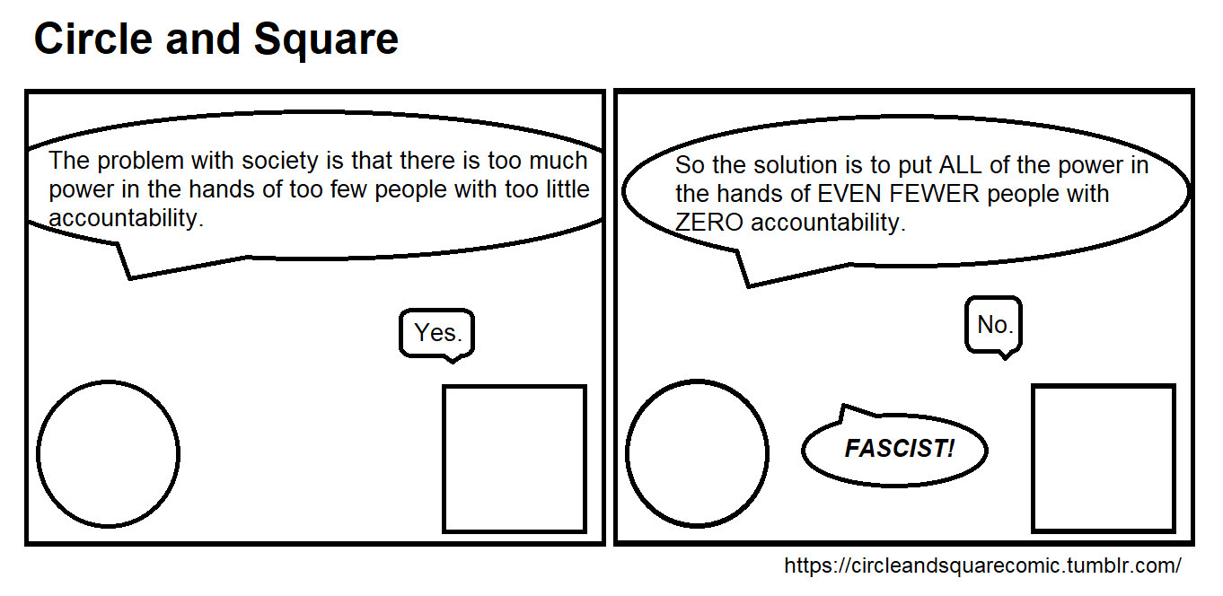
This aged well. I could remake this and publish it right now. The remake would be important though, because the speech bubbles are mostly pointing in the wrong directions. I’d also probably make the last line a little more explicit. “Why don’t you want a small group of politicians and businesses to have unchecked control over society? Are you some kind of fascist!?”
A few weeks ago some Twitter idiot, or “Twidiot", called me a fascist for saying something negative about the FBI. These people exist, and they vote too.
I think one of the reasons I stopped using round speech bubbles is illustrated well here, the things don’t fit well into the panels. While cutting them out isn’t a huge amount of work, it’s unnecessary work.
This comic seems like a good time to address the simple, geometric shape in the room that represents an elephant, the art style. I had always envisioned the comic as using minimalism. While there may occasionally be another art asset to help illustrate a point, or because I think it’s cute, I didn’t see the need for actual art when the goal was only to write a dialogue. As an example, here’s the exact same comic using more common internet memes:
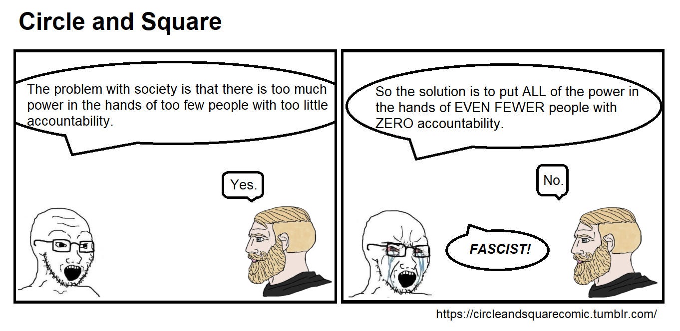
Is this comic better? In some ways, sure. It’s certainly more colorful, and the Chad meme is more detailed than what I could make on my own. But there are disadvantages as well. One major problem is I don’t own those images. Another problem is that these are memes, and will eventually date the comic horribly. Finally, using the meme images doesn’t actually matter to the comic. The dialogue, and how it represents the world, is the part that’s important. Using the meme images or even creating my own art would distract from the part the matters.
There’s also an advantage to the simple art style, in that is creates a hole in a timeline. Here’s a zoomed out view of my Twitter (not X) feed. Notice something?

Notice how busy it is. Lots of words, as expected, but some color pictures. Scrolling through would also show an occasional video that plays silently. Lots of color, lots of words, and even movement when available. So let’s break it.
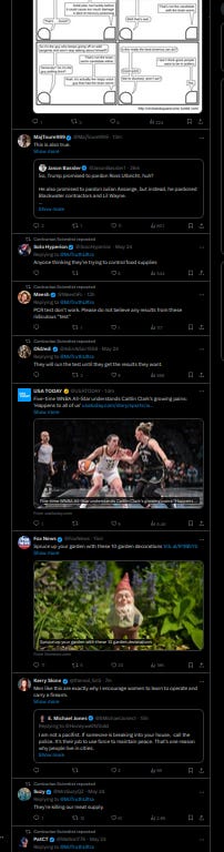
I admit my choice of Twitter (not X) theme probably helps, but the comic stands out in how little it tries to draw attention itself. It’s the dog not barking, as it were. My theory is that doing this would grab more eyes than trying to compete in the realm of noise.
I have no idea if this actually worked. Some people read it, but not a large number. I also thought making it look simple would make people more likely to read it since it doesn’t look like it would be too time-consuming. I don’t know if that worked either.
Hopefully I’ll find out someday.
The simplicity and anchor to rational reality are what drew me into your comics when I first saw them.
I wish I had more connections to get you more traffic, but so glad you're trying this platform.